Milk
Packaging design
A purely typographical approach to milk packaging created during my studies at Chiba University, Japan.
- Client
- Personal project
- Year
- 2013
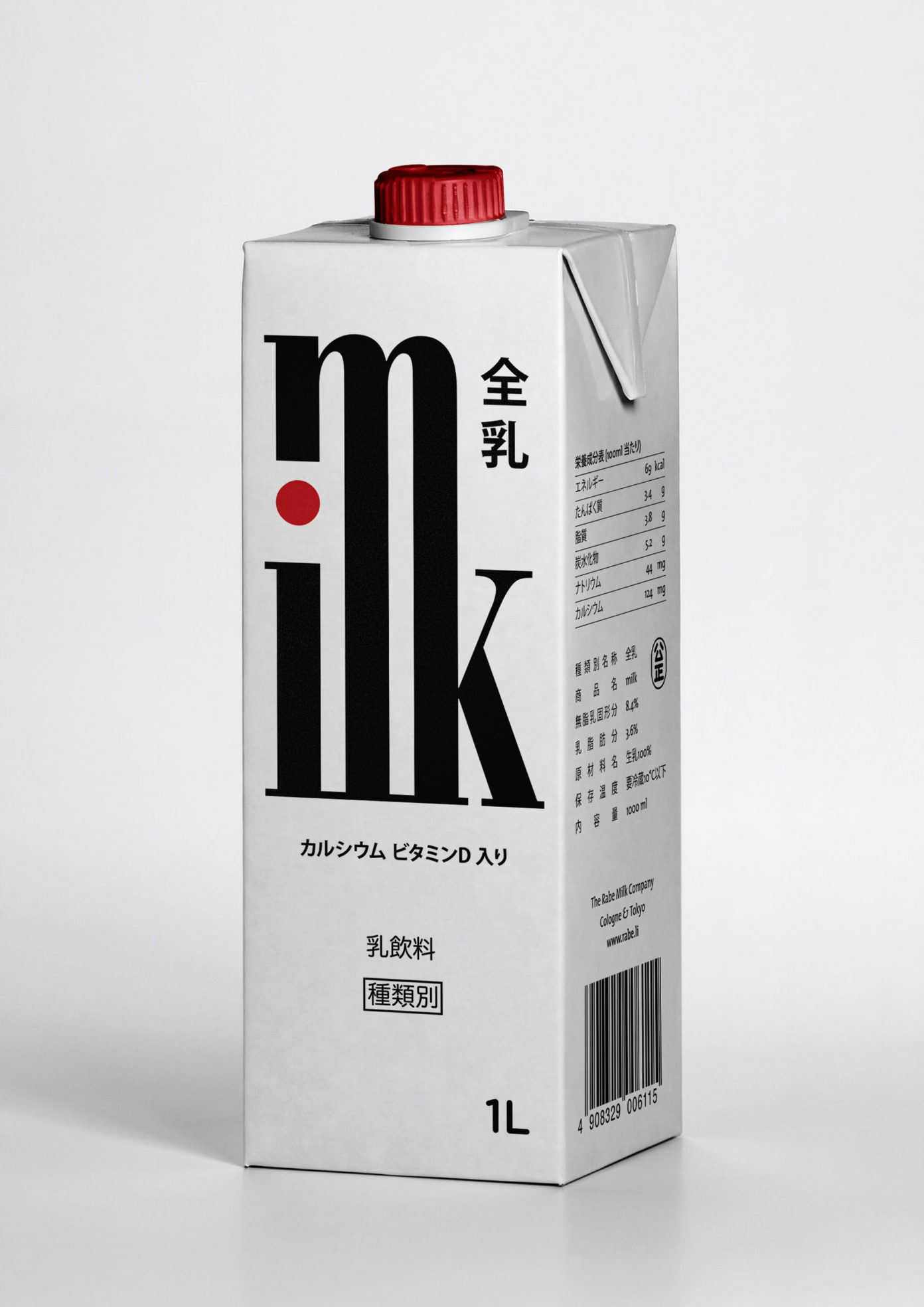
The logo type spelling »milk« references Japanese Kanji characters that are composed of various lower level characters to create more complex meaning.
The red dot on the i and the red screw cap hint to the Japanese flag to place to product into a geographic context.
Related Project
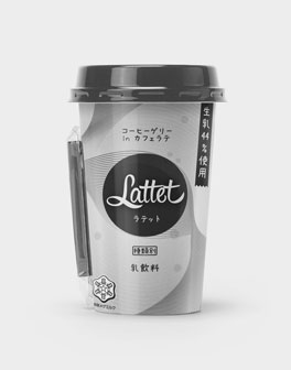
Lattet
Packaging design
Conceptual packaging design for a Japanese chilled coffee drink distinguished by its floating pieces of jelly, developed during my stay at Chiba University.